
Hares, Burials and Blackletter: The Art Behind Our AFI Designs
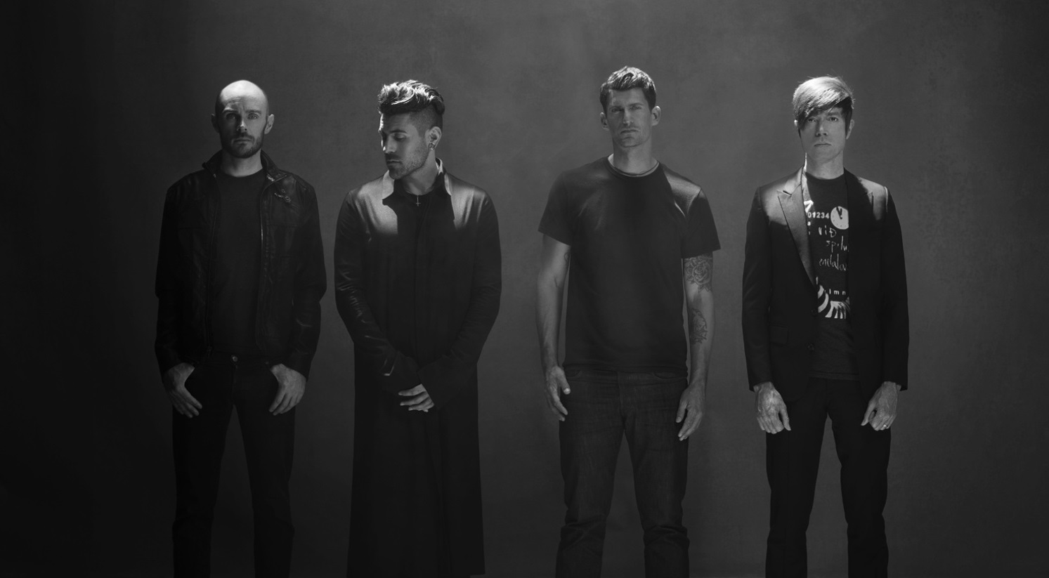
Our AFI designs fall into a few families: logos, album nods, strange creatures and band portraits. Here's what each one shows, so you can find the piece that fits you.
Which logo is which?
We have used many letterings over the years, and our shop has several:
- Blackletter Logo and A Fire Inside Blackletter: sharp, old-school punk letters in white.
- Bold Logo and Bold Logo Distressed: three heavy letters, clean or worn.
- Hares Monogram and 20 Years Underground Monogram: the tall serif AFI letters.
What about the albums?
Sing the Sorrow pairs a red lowercase afi with a circle of falling leaves, a nod to the 2003 album. Decemberunderground Faces sets four band portraits above the 2006 album's name. For Burials (2013) there are three: Burials Eclipse, Burials Crescent and Burials Hooded Figure, all grey fog and dark rings. And Nooneunderground stacks the name of the closing track of Silver Bleeds the Black Sun... into a tall block of letters.
Why are there hares?
Leaping hares run through two of our favourite designs. 20 Years Underground circles three white hares around the monogram, and Hares Monogram sketches them on the back in fine grey lines.
The spooky ones
We have always had a darker side, and so does the shop. A Fire Inside Ghouls gathers three hand-drawn ghoul heads, I Remain rises a bat-winged creature under rough red letters, and Pink Sunburst turns the monogram into an eclipse.
The band, front and centre
Stencil Portrait, Pink Silhouettes and Nothing From Nowhere put the band on your merch, in stencil, spray paint and grainy black and white.
One design, every garment
Each design comes on tees, long sleeves, crewnecks and hoodies, with kids' and youth sizes too.
Find your favourite: browse the collection